Thursday, 30 April 2015

The Victim

Due to my previous post, I have decided to create the Victim..........

...........Mrs Laderman. 


 Based on the ideas of my brain storm, I have come up with an idea as to why she is the victim. 

Yes, Mrs Laderman is Claudia's friend and confidant. BUT because of her jealousy about her and Quentin, she takes action.

The jealousy has been building up in Claudia and she has had enough of Quentin's behaviour. She comes up with a plan, inviting Mrs Laderman over for a drink. She has one too many, as Claudia hoped, so she suggests that Mrs Laderman stays in one of her rooms.
Claudia tells Mrs Laderman she is going to bed, but Mrs Laderman can hear her arguing with Quentin. She knows he is just in her head, but when she overhears Claudia say "if you don't kill her, I will!" she is terrified and calls 911. As she does so, she can hear footsteps coming to her room. Is this the end for Mrs Laderman?


Friday, 24 April 2015

Bates Motel Final Evaluation

I have had so much fun thinking of my own episode to be in the final series 3, I've really enjoyed thinking of scenes and ideas of how my characters can fit in. This has probably been the best part of the project for me. I am happy with my final images from the shoot. Both of my characters were shot in the studio because I wanted my makeup to be clearly seen with strong lighting. However, I would like to create a location shoot where my characters would be seen fitting in to the series properly. 

Because of my chosen series, it didn't require any really special effects makeup. They are normal characters who are schizophrenic and with mental disorders, this isn't necessarily shown through makeup but the characters themselves. As we are creating character makeup, I was really interested in creating a good storyline behind it and then working the characters around to fit into the series. The characters look like normal people in the original film and tv series which is why they are normal in my version of the series. Horror isn't necessarily blood and gore, it can be the behaviour of the characters and the evil within controlling them that makes us scared.

I do like creating special effects makeup, which is why I have come up with the idea to additionally create a series of photographs from my series of the characters in action, which I feel is where the real horror is. Below I have created a brainstorm to help me with ideas for creating photographs of "the victim".

To me, psychopaths are normal looking people who you could trust which is why that makes them scary because of the unknown. Its the stuff they are capable of doing that makes us frightened, which is why I want to create the scary side of them in action.


Tuesday, 21 April 2015

Claudia Shoot and Evaluation

Products:
- Kryolan foundation palette
- Translucent powder
- Viva eyeshadow palette
- Black eyeliner (gel)
- Mascara
- Mascara wands
- Brushes
- Hair brush
- Hair straighteners
- Pin tail comb
- Sectioning clips
- Kirby grips

Steps: Makeup:
1) Leave on Quentin's makeup. Using blacks/browns/whites, create a smokey eye effect. Making sure it is blended well.
2) With a small angled brush, apply the liner along the lash line and make it winged.
3) Using the mascara wands, apply mascara to top and bottom lashes.
4) Powder/conceal over the bruises so they almost cover, but so you can slightly see them.
5) Using the foundation (FS38 & Alabaster) and skin base white, conceal over the scars and scabs to almost cover.

Steps: Hair:
1) Section hair to make it easier to curl.
2) Using the straighteners, curl the hair to give a wavy effect.
3) Once curled, pin back fringe to the sides, underneath the remaining hair so that the pins are covered.


Front


Full Length

Side View
 Please note: Blogger bleaches out colour. Image appears darker. ^

Favourite Side Shot

Key Word - Stitches
Close up: Before and After Covering Up

Evaluation

Again, I am happy with how this photo has turned out. It made it so much easier for me to create Quentin first as the bruises and cuts from the stitches were already exactly in place so it meant I could cover over them perfectly, just like Claudia would have done herself. I feel like I have portrayed my idea across well and adding accessories into it such as a bike helmet to create her pregnancy bump has added to the character herself and showing my storyline throughout the images I have produced. Again, what challenged me the most was trying to make her look like a psycho, I needed to think of ways that would make her eyes look evil, so I created browns and reds underneath the eye to make them look sore and scary. I have covered up the bruises and scars but so you can still see them (which I learned when creating my Estella design). I think my model did a good job of transforming from a boy to a girl and the creepy smile she does still scares me. I am really pleased with the outcome and how everything has turned out. I thought it was a bit of a risk to choose a different series, rather than the typical vampires and werewolves because this series doesn't really involve any special fx. It was hard to portray a mental illness through makeup, but I am glad I chose this series as it makes my work and storyline different from others as I have taken an alternative route. I have loved creating both of these characters and it has been great fun creating my own take on season 3's last episode "Psycho".

Quentin Shoot and Evaluation

Products:
- Kryolan foundation palette
- Illamasqua skin base white
- Viva eyeshadow
- Red eyeliner pencil
- M.A.C eyebrow pencil - lingering
- Fresh scratch blood
- Brushes 
- Black Thread
- Collodion
- Kiko red eyeshadow
- Wig
- Hair brush
- Sectioning clips
- Hair band
- Kirby grips

Steps: Makeup: 
1) Mix the foundation palette (Alabaster & FS38) with skin base white so the makeup appears slightly more paler than the face.
2) Pencil on eyebrows to fill them and shape/define them.
3) Using the viva palette, mix purples/reds/blues/greens/yellows to make bruises on the forehead and the cheek. 
4) Apply brown under the eye to create bags using a red eyeliner, pencil along the waterline and blend to create redness. 
5) Apply collodion around the mouth (top and bottom) using the thread, cut down to size to fit over the mouth. Press and leave to dry. Repeat until the whole mouth is covered.
6) Once dry, apply the scratch blood over the top to create a blood effect.

Steps: Hair:
1) Pull hair back into a tight ponytail, quite low down. 
2) Clip fly-away bits of hair back, especially the fringe, hair by the ears, and the back of the neck.
3) Apply the wig so it fits securely.


Front

Full Length 

Favourite Side Shot

Key Word - Bandages


Evaluation

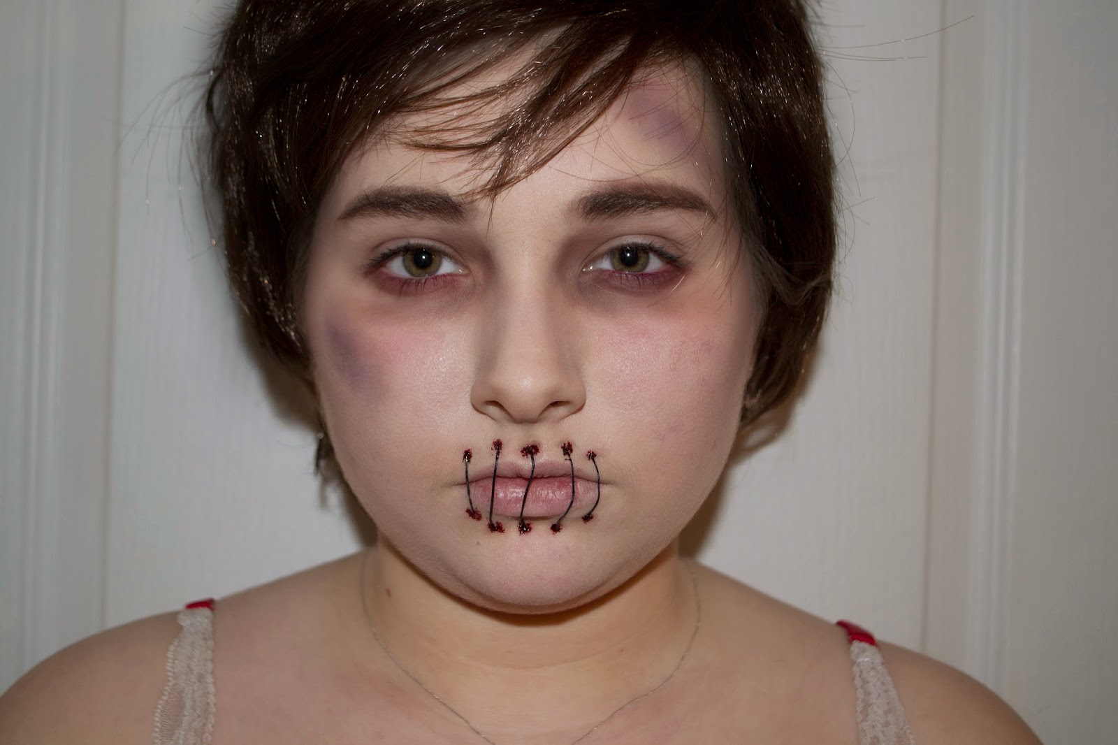
I am very happy with how this shoot has turned out. I think he looks really evil and like a psychopath which is exactly what I wanted to portray. The one thing that challenged me the most, throughout the whole process was trying to make Quentin (who is a girl) look like a boy. We know it is a girl who transforms into a boy but the viewers for my series won't find this out until the last episode that I have  created, so I need to make him look as realistic as possible. Another thing was the wig, Claudia would need a wig in order for her to pull off her transformation. But the one I managed to get wasn't very realistic looking, the shine was the main problem, especially being shot in the studio with the bright flashing lights. (If I do wig making next year, I'll hopefully be able to make my own for next time!) Despite the problems I faced, I am extremely happy with the outcome. The images have come out exactly as I hoped and I feel my idea has been portrayed across well. Apart from the stitches and bruising, the makeup doesn't really involve any special fx or any horror as such to it. However my characters behaviour is what makes it a horror series. It is not always necessarily portrayed through makeup, but their actions. 
Because I did my shoot quite early, I managed to get some advice from Kat - who told me to soften down the redness in the eyes with photoshop. Below I have done so, comparing the two images to see the difference. I will submit the original, untouched photo for my assignment. 

Left: Before                       Right: After

Hard to see but looks so much better blended (Kat was right!)

Prep for Shoot


Notes for creating both Characters


Makeup and Hair Products to create Quentin


Makeup and Hair Products to create Claudia


Above are all the notes, makeup and hair products, accessories and clothes that I will need in order to create my characters. I am all ready and set for my shoot!

Monday, 20 April 2015

Claudia Final Design and Practice

Products:
- Kryolan foundation palette
- Translucent powder
- Viva eyeshadow palette
- Black eyeliner (gel)
- Mascara
- Mascara wands
- Brushes
- Hair brush
- Hair straighteners
- Pin tail comb
- Sectioning clips
- Kirby grips

Steps: Makeup:
1) Leave on Quentin's makeup. Using blacks/browns/whites, create a smokey eye effect. Making sure it is blended well.
2) With a small angled brush, apply the liner along the lash line and make it winged.
3) Using the mascara wands, apply mascara to top and bottom lashes.
4) Powder/conceal over the bruises so they almost cover, but so you can slightly see them.
5) Using the foundation (FS38 & Alabaster) and skin base white, conceal over the scars and scabs to almost cover.

Steps: Hair:
1) Section hair to make it easier to curl.
2) Using the straighteners, curl the hair to give a wavy effect.
3) Once curled, pin back fringe to the sides, underneath the remaining hair so that the pins are covered.

Final Design


This is the scars before I concealed them up, helping me get the scars in the same place. 


It makes it so much easier to leave Quentin's makeup on and then work over the top of it. This way I get the exact position of the scars and bruises, making it more realistic although she has covered them herself. I feel confident about my shoot, I think when the hair is properly styles and my model is wearing her characters clothes it will all come together. I am excited to do it. 

Friday, 17 April 2015

Quentin Final Design Practice

Products:
- Kryolan foundation palette
- Illamasqua skin base white
- Viva eyeshadow
- Red eyeliner pencil
- M.A.C eyebrow pencil - lingering
- Fresh scratch blood
- Brushes 
- Black Thread
- Collodion
- Kiko red eyeshadow
- Wig
- Hair brush
- Sectioning clips
- Hair band
- Kirby grips

Steps: Makeup: 
1) Mix the foundation palette (Alabaster & FS38) with skin base white so the makeup appears slightly more paler than the face.
2) Pencil on eyebrows to fill them and shape/define them.
3) Using the viva palette, mix purples/reds/blues/greens/yellows to make bruises on the forehead and the cheek. 
4) Apply brown under the eye to create bags using a red eyeliner, pencil along the waterline and blend to create redness. 
5) Apply collodion around the mouth (top and bottom) using the thread, cut down to size to fit over the mouth. Press and leave to dry. Repeat until the whole mouth is covered.
6) Once dry, apply the scratch blood over the top to create a blood effect.

Steps: Hair:
1) Pull hair back into a tight ponytail, quite low down. 
2) Clip fly-away bits of hair back, especially the fringe, hair by the ears, and the back of the neck.
3) Apply the wig so it fits securely.

Final Design 


Practice

The first photo is the original one I have taken. The hair looks too wig-like in the flash so I have edited it in photoshop to make it appear darker and to dull out the shine. I am really pleased with how it has turned out, he looks beaten up and sad about it. 

I think these lips actually look quite realistic. I am very happy with how they turned out, they look much better being a thicker thread. 


These are the other images before Photoshop, again I am very happy with the way they look. Now I have had a practice, I feel much more comfortable with doing the final shoot. I will be shooting in the studio, mainly because I want the makeup to be clearly seen.  

Practicing Claudia's Scars

Products:
- Eyelash Comb
- Concealer

I picked off the scabs using an eyelash comb. This made it easy for me to see the exact placement of the scars. 


I then mixed a concealer to cover over the top of the scars. It has helped me understand how I need to cover them and what colour concealer to put over as I feel this one is too yellow. I think I may use left over foundation to conceal, this way it will be an exact colour match. However for my first attempt I am pleased with how it looks.


Every time I practice a part of the character, it gets me really excited to do my shoot!

Practicing Quentin's Stitches


Products:
- Spirit Gum
- Black Thread
- Kryolan Fresh Scratch


I used spirt gum to double over the thread and stick it together. Once dry, I measured against the lips and cut into sections to fit over. I then applied spirit gum to the skin in the positions I wanted the thread and held in place for a few seconds. 


Once I was happy with the position of the stitches, I applied the fresh scratch to the ends of each thread. I am pleased with how it has turned out, especially for my first attempt.

However, to improve I am going to double the thread over twice so that I have a total of 4 pieces of thread glued together. This will make the thread thicker and stand out more. 

Once I had photographed it, the stitches were then ready to come off.

Tuesday, 14 April 2015

Quentin's Styling

Below is a very very quick sketch of how I want Quentin to look. I have also created a mood board to show the style of clothing and hair design I want him to have. 


I would like him to be wearing a white t-shirt with a black leather jacket and messy hair with a sweepy fringe. This to me, is a typical American look. 

Claudia's Styling

Claudia is pregnant in my series so I want her to wear black and white top with black jeans and a jacket. I have chosen black and white to represent two opposite extremes. White means purity and innocence whilst black to me means power, death and evil. Black is often associated with fear and the unknown.

White = Claudia
Black = Quentin

(drawing of ying yang)


Friday, 10 April 2015

Development of Claudia

I have to make Claudia's bruises and scars in exactly the same place as Quentin's. This will be tricky, so I will create Quentin first then I will have the bruises and scars on the face already so I can powder over to transform my model into Claudia. I have created a dark smokey eye with liner and she has red  under her eyes to make her look a bit of a pyscho. 

Developed Design


I am really pleased with how it has turned out, I will practice covering up the scars and bruises to make them slightly visible so the viewers will guess they are the same person. I am excited to practice and shoot both of my characters!