Saturday, 28 February 2015

Developing Estella Ideas & Face Charts


Design 1

I still like the idea of Estella being her beautiful self, however I think I want to create a different side to her, maybe that isn't explained a lot in the book.

When I first think of Estella I think of the heartless little girl she was brought up to be. Because she is so well known for her cruel behaviour, I want to create the other side to her that isn't really noticed. In the book we learn that she was in an abusive relationship with her husband Drummle, this would have obviously knocked back her confidence making her scared and timid. 
Most people in abusive relationships tend to not seek help or tell someone, they simply hide it because they are too scared on embarrassed to tell. I want to create the fact that Estella is in an abusive relationship, but I want to create the makeup like she has hidden the cuts and bruises on her body. Drummle would have beat Estella but because she didn't want anyone to find out, she covers the marks with powder. Her hair is also long at the sides which would hide the bruises too. 

Image from: http://2.bp.blogspot.com/-TY9t9Ej1Sw4/
UfelabZUV9I/AAAAAAAABQQ/bCN2wju4cJQ/s1600/DSC00779.JPG
 I want to create hand marks on her body, maybe round her neck where Drummle may have grabbed her. The above picture shows a real hand mark on the body, I am going to practice something similar to make it look realistic.


Design 2

 I am really pleased with this idea and how it has turned out. I like the black eye and cuts that have been powdered over. You can still see them which is my aim but I want to to look although she has powdered them over herself, hiding the fact she has been beaten up. Because I feel I have a good story behind the makeup, I am going to use this idea as my final design.


Design 3

I tried to create a contrast, Estella before she was beaten up, and after. This demonstrates the effects of domestic abuse and shows people what it does to them. However, I don't think it is strong enough for a final design.

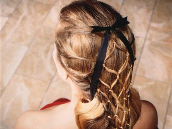
Hair design:


I am so pleased with this hair design, I am going to use it for my final design but maybe add a few accessories.


Costumes

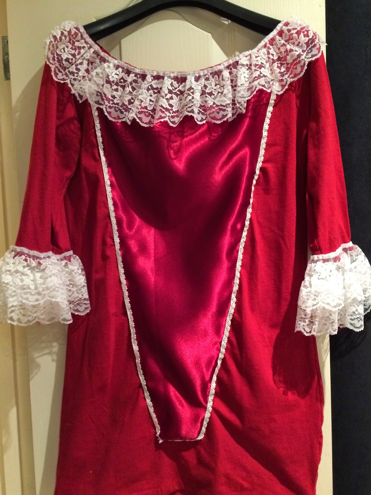
Red symbolises love, romance and passion. Estella lures men and tricks them into falling in love with her so I have chose to make a red dress for her to wear.


I bought a cheap red dress so that I could make it look Victorian. I also bought satin red fabric, lace and a small lace trim as I couldn't find the white cord I wanted. I spent the whole weekend working on this as I wanted to portray Estella's wealthy lifestyle and the clothes I think she would have worn. 


I am really pleased with how the dress has turned out, the satin on the front and lace adds a sense of wealthiness to it. Although this is an informal assessment, I want my photographs to portray Estella as a character rather than showing just my makeup and hair design, which is why I have gone to the effort of making a costume and accessories. 

Estella Hairstyles

Image from: https://s-media-cache-ak0.pinimg.com/236x/7c/
9d/96/7c9d96b3814c6a21b93b857239f7df63.jpg
As previously mentioned, there are many ways that Estella's hair has been interpreted but I want mine to be historically correct. Great Expectations was written in the 1860's. Miss Havisham would have adopted Estela in the 1840's and because Estella isn't obsessed with her past, her hair would constantly change throughout the eras. I want Estella to be portrayed as an older version, so her hairstyle would be based in the 1860s.

I have started to research 1860's hairstyles to give me inspiration when it comes to designing my hair designs. I imagine Estella's hair being neat and well groomed so the hair would obviously look perfect and be in a good condition (better than Miss Havisham's!)

Image from: https://s-media-cache-ak0.pinimg.com/
originals/08/3c/53/083c5380b33326259e25a4478389559f.jpg
I like this hairstyle purely because of the plaits, they were very popular during the 1960s and I think I want to somehow incorporate this in my designs. 


Design 1


Image from: http://slodive.com/wp-content/
uploads
/2012/06/victorian-hairstyles/victorian-snood-style.jpg

I got my inspiration from the above image. Snoods were popular during the Victorian era and I wanted to make a contemporary version to see how it would look. However, it is far too contemporary for this project as I want to create something historically correct. It does look very pretty though!

Design 2


This design is very simple but I think it could look quite effective, especially with some accessories. I do want to push myself as I don't feel hair is my strongest point so I would prefer to choose a design that is a bit more technical.

Design 3


Again, this design is very simple but I think it looks very pretty. It could be worn during the day or even for evening wear with some accessories. But again, it isn't challenging enough.

Design 4


This design would have a middle parting with a large section of hair curled down the side of the head. The remaining hair at the back is pulled into a ponytail which is then plaited and pushed through to make a plaited looking bun. The hair will then be curled at the ends. A section at the sides of the hair will be pulled back into the sides and wrapped around the bun. This design has more technical aspects to it and I think it works well and I am happy that I have somehow included plaits. This will be the design I take forward to develop. 

Estella in Contrast

Creating Estella in contrast has helped me understand all different ways I can portray her. I can either do her younger or older, beaten up or normal. It has given me a feel of how the makeup would look and what works best. 

Young Estella vs Old Estella
Young Estella would have no makeup on, rosy cheeks and overall a natural look to her. However when she is older, she would probably wear a bit more makeup, her eyelashes would be darker, her eyebrows shaped, her skin fresh and her lips rouged. 

Before and After being beaten up 
Here I have created Estella before she was married and beaten up by Drummle. She would look exactly the same as Older Estella above. When she is beaten she would be marked and bruised and look broken. Because I like these two face charts I have come up with the idea to almost merge the two together. She is hiding the fact she is in an abusive relationship by hiding and covering the marks on her face and body. I think this is a different approach because it tells a story behind the makeup, it shows how she must be feeling and what she is going through, and what many others today go through. 

Friday, 27 February 2015

Miss Havisham Continuity Assessment I


I am really pleased with how my assessment went and how my final design turned out, everything went well and it came out just like I wanted it too. I am pleased with how well the skin looks, the cheeks are sunken and the lighting brings out where I have highlighted the face. The wrinkles are subtle as well which is good as I didn't want it to turn out too theatrical. I feel the finishing touches such as the bouquet of flowers that spell out "ADORE" and the watch stopped at 8:40 transforms just a photograph of hair and makeup into a character. Because I have added accessories and included the hand in my photographs I am slightly worried about recreating it again because I need to get it exactly the same and there is lots of pressure. However, I liked to be challenged and with the notes and the number of photographs of the stages I have taken I feel I should hopefully be fine doing it. 

I also created a continuity record sheet to help me when it comes to create my second assessment, as you can see below. 

Tuesday, 24 February 2015

The Importance of Continuity

Continuity is important in TV and film because when scenes are cut for the day and need to be continued later, everything has to be exactly the same or the viewers will notice. A continuity error is where there is no consistency in the film. 

Some typical errors occur when crew members, including the hair and makeup department, might be working on other productions, so new people are often hired to film the pick-up shots. It is essential to take notes and photographs for the continuity. Actors must be in the same place and position from the previous cut, dressed the same and have the same hair and makeup or it will be noticeable.
It is down to the departments to take their own continuity notes and photographs in order to be able to perfectly recreate it. 

Below are some examples of continuity errors. 

Image from: http://www.moviemistakes.com/images/mistakegrabs/851.jpg


Image from: https://jordansumray.files.wordpress.com/2011/10/screen-shot-2011-10-12-at-10-07-532.png


Image from: http://27.media.tumblr.com/tumblr_lggxf6krgg1qbdtwao1_400.jpg


Information from: http://www.delamaracademy.co.uk/the-make-up-artist/film-tv-make-up/makeup-continuity

Sunday, 22 February 2015

Final Practice before Assessment

Today was the final practice in lesson on my partner before my timed assessment!! I came prepared to the lesson with face charts, hair designs, notes and my kit.
Below are the photographs of the practice I did.


I'm not that happy with how this practice has turned out, the lines are too theatrical and heavy and the hair has too many curls rather than being just one. I am going to practice more so I can get it looking how I want it.

After my tutorial with Kat I decided to make the lines on my face less dramatic so that it didn't look too theatrical. We both agreed that the lines made it look very stagey and not realistic and believable. Having feedback like this helps as it pushes me to do my best. Kat advised me to get a smaller paintbrush to get the lines really fine. I quickly squeezed in practice time before my lessons (which is why my eyebrows or hair aren't grey) just to see how it would turn out using finer lines and I much prefer it. 
Although the wrinkles aren't obvious, we are doing makeup for TV and film so it would need to look more believable rather than over the top. 


Development:


In my development I have noticed a slight change and improvement each time I have practiced the ageing makeup. I have started from doing harsh lines and very theatrical looking makeup to taking on board the feedback I received and making the lines look less harsh and more realistic. Although I can see I am improving, I am still not completely happy with how it looks so I will try using an even smaller paintbrush and using my eyeshadow palette instead of supracolor as I think it will be easier to blend in with the skin and look softer. 


I was in the library and had a look for books relating to tv/film/theatre makeup and came across this amazing book "Stage Makeup - Richard Corson". I am annoyed I have only just discovered it! After reading up on ageing makeup I have become a lot more wary of the muscles in the face and where the wrinkles would be! I had a quick practice on myself to test out my newly found knowledge and I am really pleased with the outcome!